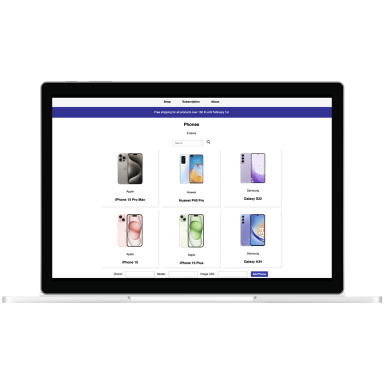
Smartphone webpage
Role
Web developer
Duration
Three weeks
Tools
Javascript, HTML, CSS, Github
_____________________________________________________________________________________________________________________________________________________
This was a group project with a fellow student as part of the Web Technology course at Vrije Universiteit. The course focused on learning key web languages and protocols such as URI, HTTP, HTML, CSS, and JavaScript.
We were assigned the task of developing a website for smartphones. The project required us to explore various functionalities offered by the relevant web technologies. Given that this was an assignment, our focus was on experimenting with and demonstrating specific features, which meant we had limited creative freedom. As a result, some of the design choices may appear questionable, as they were driven more by the need to showcase certain technologies rather than by considerations of design or user experience. This led to decisions that prioritized technical implementation over intuitive or aesthetically pleasing design. The API that was previously used through VU is no longer available. This change has caused the website to no longer operate as it did in previous iterations. View the original project here!
Context
____________________________________________________
Role Web developer
Duration Three weeks
Tools Javascript, HTML, CSS, Github
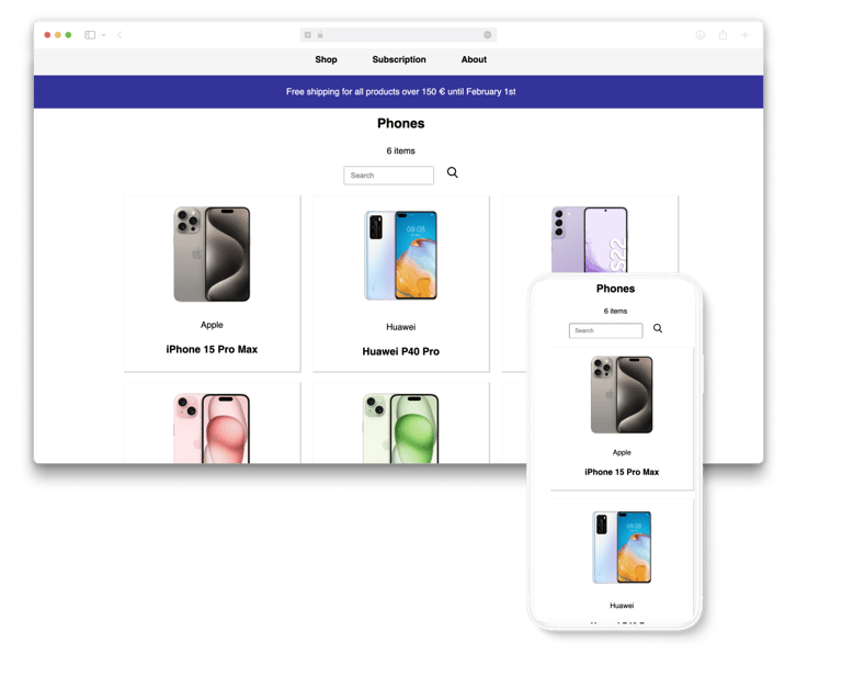
The website was redesigned to reconstruct some visual elements from the original, with a primary focus on recreating the structure and usability. Due to the unavailability of the API, many features were hardcoded in the new version. This redesign aimed mainly to showcase the functionality of the original site rather than to enhance its overall design or change its functions.
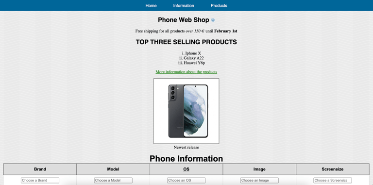
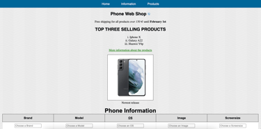
The initial design
Redesign
DESIGN
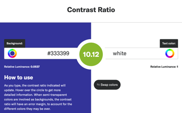
Our main focus was on web accessibility. We employed contrast ratios to focus on WCAG 1.4.1 (Use of Color) and 1.4.3 (Contrast).
We also examined WCAG 1.4.4 (Resize Text) and confirmed that the text on the website adapts satisfactorily when zoomed up to 200 percent without losing content or functionality.
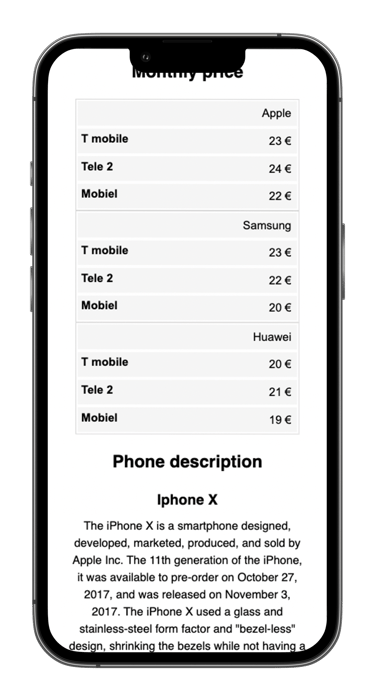
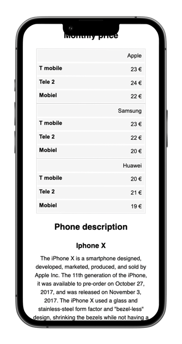
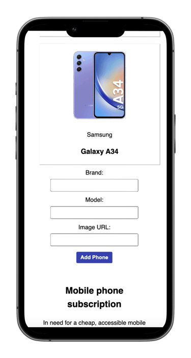
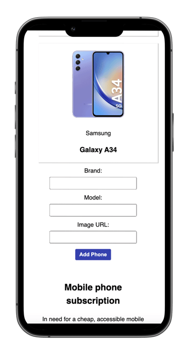
Responsive design principles were implemented using media queries for screens with a maximum width of 768 pixels. We used percentage-based widths and added the viewport meta tag to ensure the browser renders the page in a way that responds to the device's screen size. Testing was carried out using Chrome DevTools’ screen emulator.


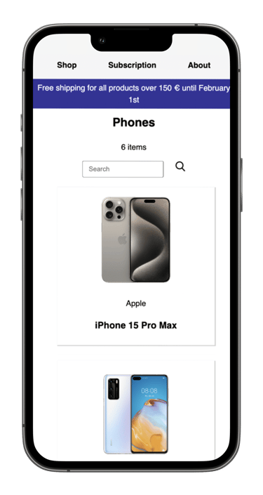
Responsive design
Web accessibility


DESIGN
DESIGN


During this period, I have improved my web development skills by learning HTML, CSS, and JavaScript. I have specifically focused on enhancing my collaboration skills, both in general and through GitHub, where I have shared code and worked with others. Working with RESTful HTTP APIs has expanded my abilities to handle data communication and service integration. Additionally, I have deepened my understanding of accessibility by learning more about WCAG.
Final takeaways
RESULTS
GitHub link to the original website from the project:
GitHub link to the new website from the project:
